2025 Damenkom
Damenkom
Payment and the experience after the purchase: a clearer checkout, a calmer post-purchase, fewer “where is my order” messages.
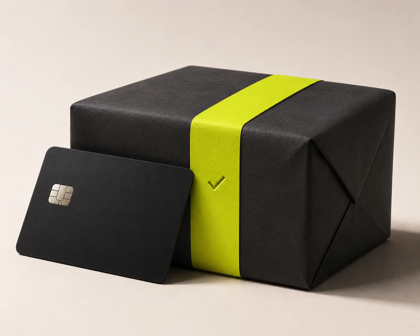
Most of the effort in commerce goes into getting to the payment button. Most of the anxiety starts after it. Damenkom asked for both: a checkout that converts and a post-purchase experience that keeps customers calm until the parcel arrives.
01
Context and problem
Checkout abandonment was concentrated on the payment step, and post-purchase support was dominated by delivery status questions.
02
Approach and key decisions
We redesigned checkout as a single page with saved methods first, and turned the order status page into a live timeline with proactive messages.
One page, saved methods first
Returning customers pay in two taps.
Status as a timeline
Each step has a time, a place and a next expected event.
Tell before they ask
Delays trigger a message with the new estimate before the customer notices.
03
Outcome
Illustrative figures. Replace with measured outcomes before publishing.
lift in payment completion
fewer “where is my order” tickets
to pay for returning customers
The order page finally answers the question before the customer asks it.
Damenkom · sample
What I’d carry forward
- Post-purchase is a product, not a page.
- Proactive messages beat faster support.
- Saved methods are the single biggest checkout lever.
→ Next project
OSINT
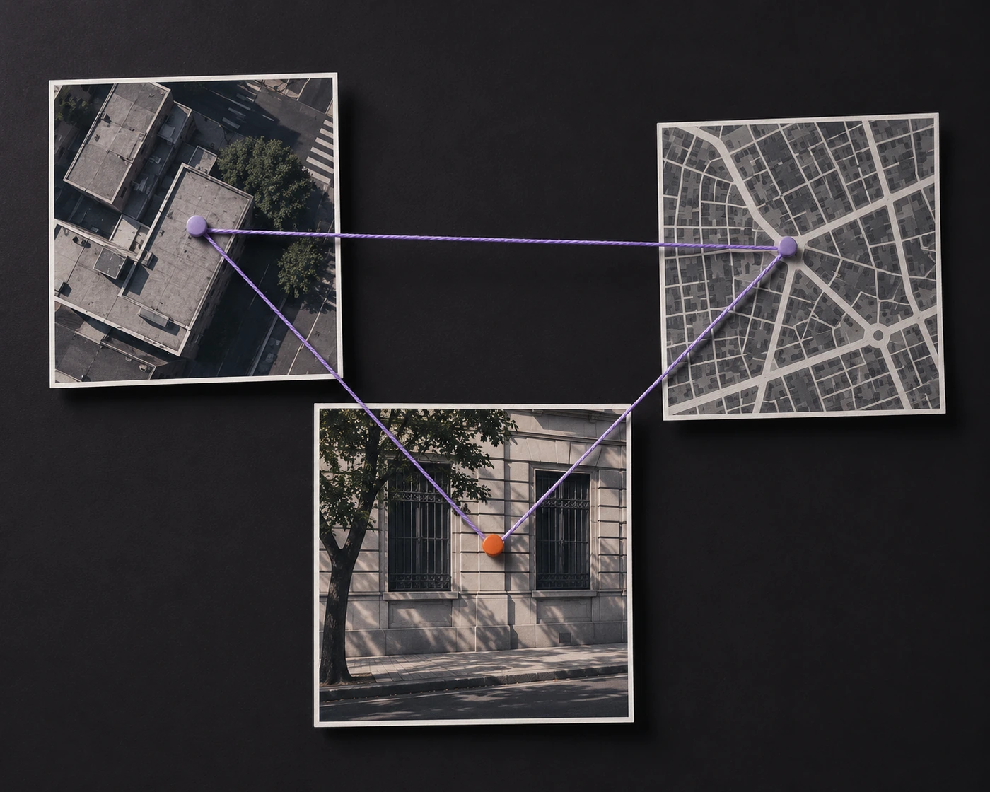
Open-source intelligence told through three public artifacts: how analysts connect sources, and the interface that makes those connections visible.